Hi! And welcome to this new (potential?) series in which I share images of design that moves me.
Most are sourced on Pinterest and Instagram. Occasionally I will find them elsewhere on the designers’ websites or shelter magazines. I don’t use Instagram as much personally anymore but I do have another account set up where I follow all of my design/art/inspo accounts. (It’s actually the old Salt House account, which is, for now, called @sarahspiegelhome. Just a little side tip if you want to use Instagram less, or in a healthier/more productive way, you can try setting up another account. I am loving it.)
Things have been progressing tremendously with my new textile line (!!) which is making me very happy. Naturally many of these images have inspired me and my work in some way so I will include notes on that as it comes up.
OK, now onto the beauty…
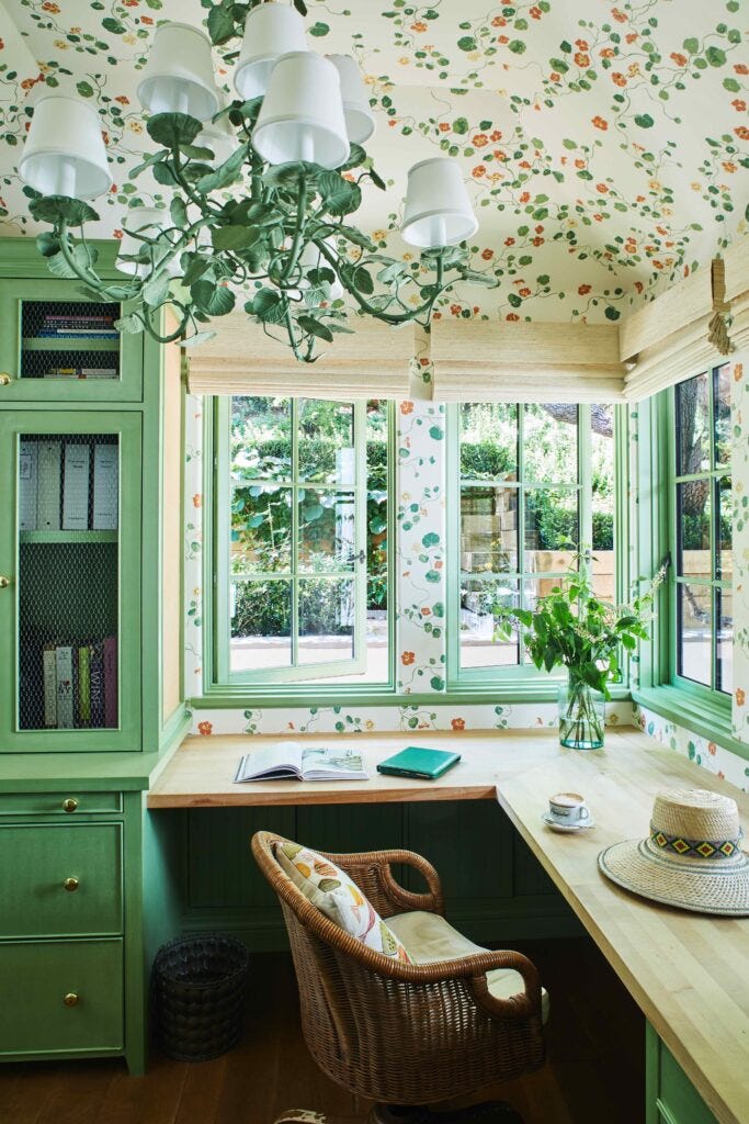
An inspiring office space.
I love a built-in desk, and this one almost seems like it could be in a kitchen, which I saw a lot of as a kid growing up in the 90s. This image sort of makes me want to bring that back? Or, I don’t know, I could imagine it as a craft room, or somehow adjoining a laundry room. A multi-use space of some kind. The nasturtium pattern on the wallpaper is another favorite, which also reminds me of the 90s and my Aunt Sandy’s beautiful white and green kitchen, which was all done in the theme of green ivy. Wallpaper, borders, ceramics — anything to which you could add an ivy motif, she had it. I’ve found myself inspired by so many vintage patterns and this is definitely one of them. I have an idea in my head for a remake of this classic ivy print, so maybe it’s something you’ll see from me in the future.
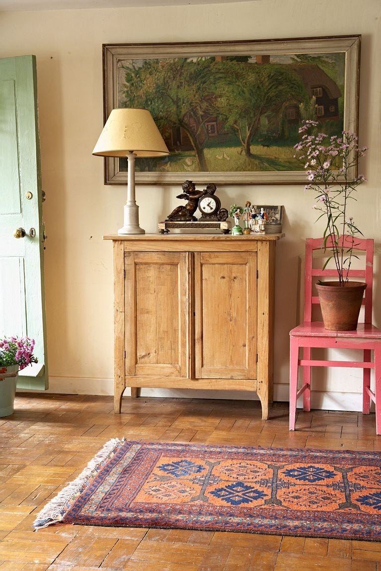
A pop of pink.
I love a pop of color by way of a painted chair. And even better — it’s a simple DIY that anyone can do. Pink is having a moment now but I think this shade feels timeless. It’s a bit more muted than the Barbie pink that has been taking over runways. I am playing with using a similarly delicious shade in my line that I’m calling peony.
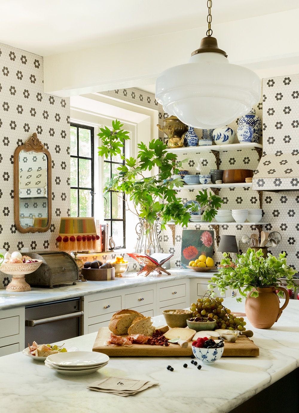
Tiled kitchen walls.
Another image that has surfaced everywhere — for good reason! I adore these tiled walls in the kitchen of Lily Aldridge, by one of my favorite design duos, Pierce and Ward. It’s so fun and full of personality yet at the same time, the black and white, simple flower pattern makes it timeless. I love that you could continue layer patterns and colors in this room and it would all still work.
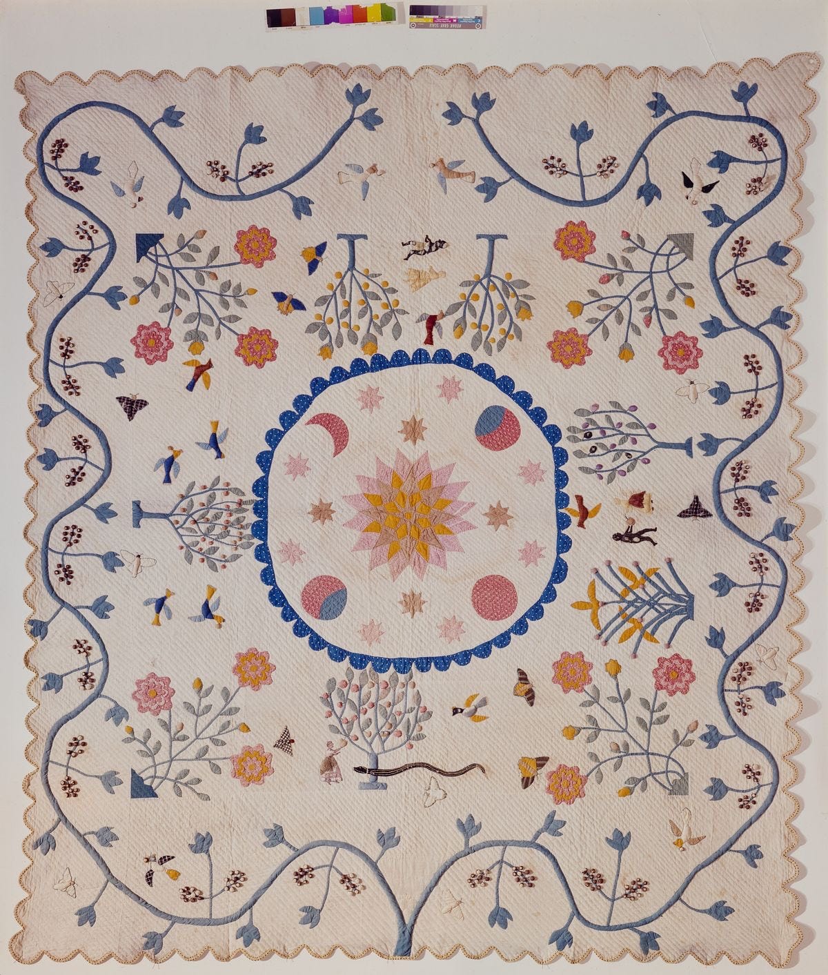
This quilt.
I am endlessly inspired by quilts. I love the rich history, how every quilt would tell a story about the woman who made it and family to which it belonged. A snapshot of a time in history. If you haven’t seen the documentary about the incredible women of Gee’s Bend, you must! And if you get as into it all as I did, you could even head to your local library to track down this series on the history of quilts. I found it fascinating. I love the celestial motifs in this quilt from the later 19th century, depicting scenes from the Old Testament.
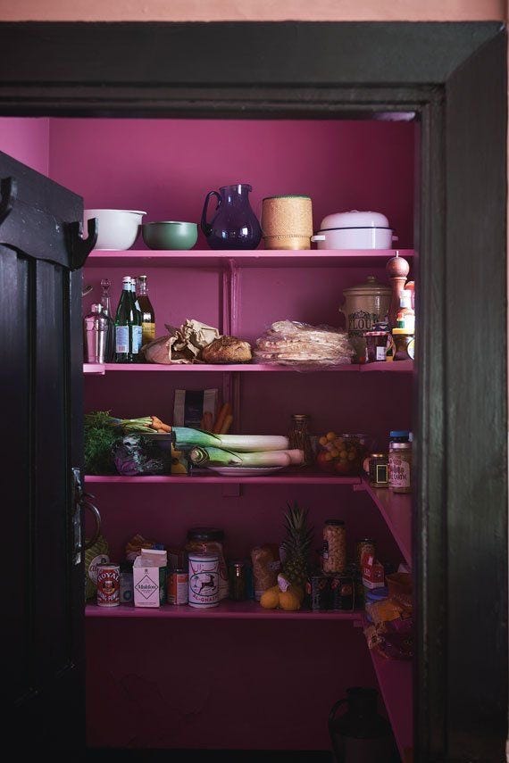
A black and magenta pantry.
A few words I never would have imagined together. This is just really cool. They say that when you’re dealing with a small space it’s better to go darker with the paint so perhaps that was part of the reasoning behind choosing black. I love this faded black by Farrow & Ball. And the bright magenta berry, idk, just a total badass move but more importantly one that works. I love this idea for any small space or city dwellers, for turning a closet into something magical.
Whimsical walls.
This is one of my favorite house tours I’ve seen in a long time. It’s so perfectly layered and eclectic, so full of color and pattern. The kitchen! The breakfast nook! And the pink and white striped bathroom. I especially loved this whimsical wallpaper by Carlos Moto for Pierre Frey.
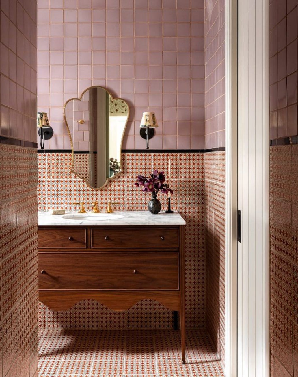
A dreamy tiled bathroom.
Heidi Caillier is one of my favorite designers. I love the mix of color and pattern in this bathroom, it’s a combination that I keep returning to. And the gorgeous vanity and the mirror, the way the scalloped shape appears in both. And the sconces! Everything is just perfect.
New color combinations.
Another gorgeous celebrity kitchen, this one in the charming country cottage of Sienna Miller. Now, there was once a day when I wouldn’t have thought to put all of these colors together; the blush and the green, yes — well, maybe even the blue, but the pop of magenta by way of the tablecloth would have caught me off guard. But these are exactly the types of combinations that I’ve found interesting and been playing with lately. I’ve been loving this mix of more chalky and muted earthy tones with brighter, even fluorescent accents. And this is the beauty of table linens specifically — you can change them out with your mood, and have complete space to play and experiment.
A sexy fridge.
Some people dream about vacations and designer shoes, I dream about built-in refrigerators and creamy painted cabinets. (Okay, fine — maybe I dream about both.) Green is probably my favorite color when it comes to design. I think it works with nearly everything, in so many different shades. Though this one is a favorite, and very similar to a shade I’m using in my line and calling fern. This account, deVOL Kitchens on Instagram, is one of my absolute favorites.


